
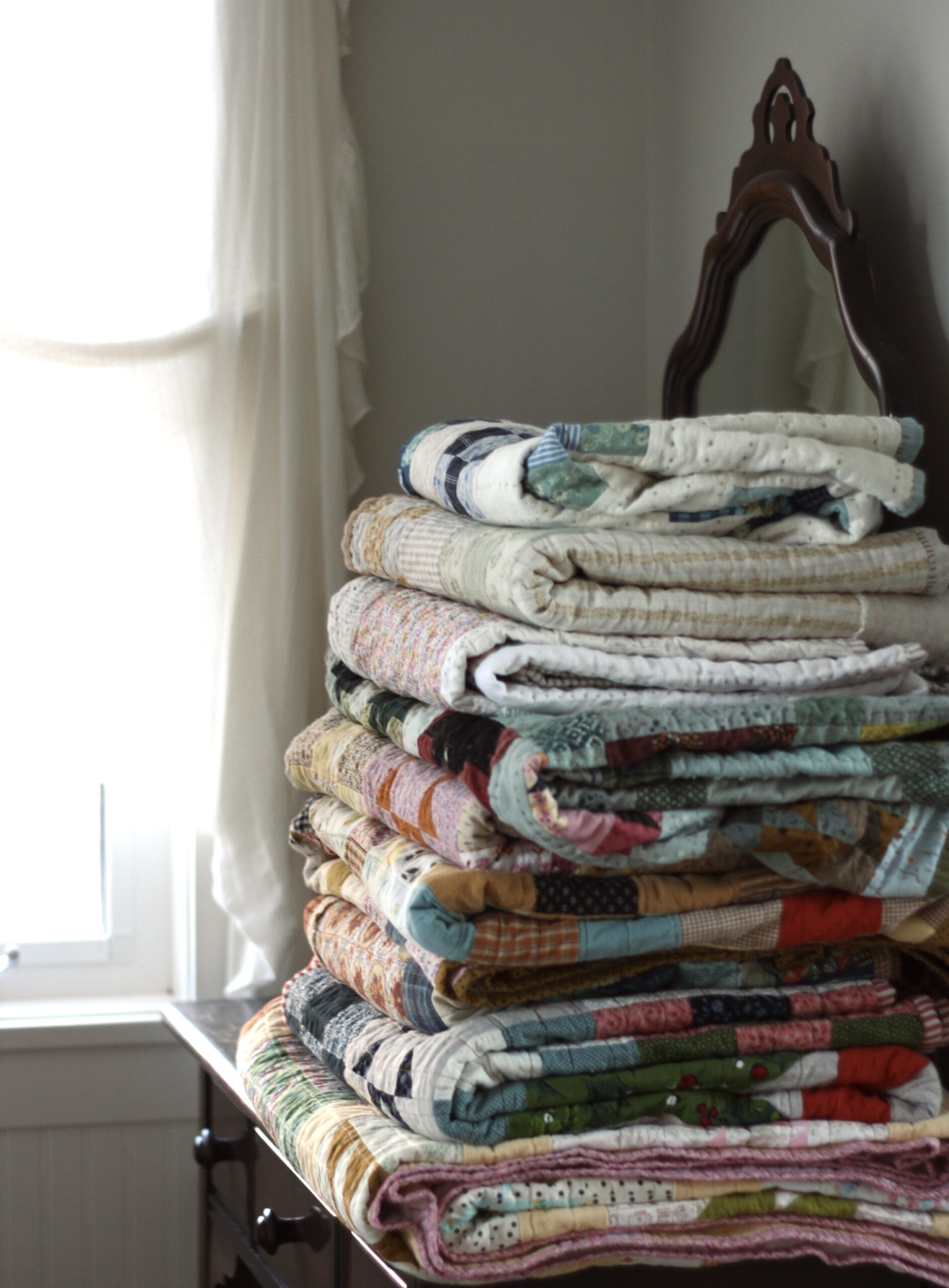
I started with the Heather Ross Princess fabric in dark plum. I added the mustard yellows, bright pinks, and grassy greens. This combo sat on my shelf for a few months, waiting for it’s moment in the spotlight.
Then I decided to make a girl quilt from simple squares and decided to use this stack. Once again, my original choices had only half the fabrics you see here. Somewhere along the way, I decided to add aqua to the color scheme. And then I decided that most of the fabrics were too much in the mid-value range.

Technical terms like values and intensity, rarely enter my head when choosing fabrics. I just put together what I like, and don’t analyze why it does or doesn’t work. But lately I’ve been thinking a bit about values. Putting it very simply for me, that would be the light, medium or darkness of the fabrics.
Take a black and white photo and you’ll see the true “value” of each fabric.

As you can see, a majority of these blocks blend together in their mid-value loveliness. I am not promoting any type of “rule” here, since I’m a firm believer in making things you love, not things that are “right”.
It’s just some interesting observations, since I’ve been thinking a bit more about this. If you want your quilt to “sparkle” or certain aspects of the design to stand out, then definitely think about using contrasting values.
An interesting read about values here: (Scroll part way down to find the section titled “Values”. And check out the computer generated diagram of the two quilts. Doesn’t the one on the right just “sparkle” a bit?)
And a bit more about values here.

Anyways, whether this quilt has the right balance of values, or not, I’m rather in love with these colors right now.
Thank you for that tip about black and white photography and values. I now understand more about value in one simple move than I have ever before.
Beautiful color combo! Will have to try that sometime. Lovely quilt. Jenn
absolutely yummy fabric choices, and great tip about taking a black and white photo! And as I have a new camera I know how to do this now!
Wow, I just discovered your blog from flickr or somewhere. Gorgeous gorgeous stuff!!!!!!!!!!!!! I love your fabric choices and designs. I may have found my new quiltspiration person. Bye bye Alison @cluckclucksew! 🙂
love it! seeing all of these makes me want to start right now on my dream on quilt… i am doing just squares, from two charm packs with solids mixed in… going to start today!
Thanks for sharing the value links – how timely! I've beens studying value lately and am fascinated at the difference it can make in a quilt. And I agree with you – that quilt is adorable, range of value or not!!
Cute, cute, cute. Great colors. I always go for plum… Good value thoughts, Jolene.
I love this! I love simple but colorful quilts!
I know a lot of quilters take "value" seriously in their quilts and, true, their quilts are gorgeous….BUT I'm with you…make what you love and don't sweat it 🙂
I love simple colorful quilts like this. They are beautiful and easy at the same time.
Love your blog also 🙂
Beautiful quilt, love those colours!
I love it and I totally agree about making things you love.
I think these are great colours, really fresh and not too "seen it already" if you know what I mean! Well done on bending the rules successfully 🙂
Love love. So pretty and I really have to have some of that farmdale blue floral. Love the simplicity of a beautiful patchwork quilt.
It's lovely – I think the balance is just right.
Such a pretty quilt, gorgeous colours! Im very interested in the concept of colour value too so thanks for the links, i will be making a cuppa and having a good read!
Thanks for the good tips, links and valuable info about color values! Now I want to go look at all my quilts in black and white…..
love it! i already commented on flickr, but wanted to mention that i love your photographs. they always draw my eye! 🙂
I can't tell you how much I love this quilt! I featured it on my blog today! Thanks for sharing 🙂
I just love simple quilt patterns like this. I have a pretty good idea about how to make the top, but the binding and all… no idea!